Embracing Cultural Context in App Design: A CTO’s Perspective on the Success of Chinese Apps

As a Chief Technology Officer (CTO), one of my primary responsibilities is to oversee the design and development of applications that not only function well but also resonate with our users. In the globalized world of tech, it's easy to fall into the trap of believing that one design fits all. However, my experience and the insights from the video "Chinese App Design: Weird, But It Works. Here's Why" have shown me that this assumption can be misleading. The truth is, what works in one market might fail in another, and understanding the cultural nuances of your target audience is crucial to the success of any digital product.
In this blog post, I’ll delve into the unique aspects of Chinese app design and why these "weird" design choices work so well. I’ll also share my perspective as a CTO on the importance of cultural relevance in product design and how these lessons can be applied to create more effective and engaging digital experiences.
The Misconception of Universal Design Standards
In the tech industry, we often celebrate simplicity, minimalism, and clean aesthetics. These design principles have become almost synonymous with good design, especially in Western markets. The influence of companies like Apple and Google, which champion sleek and straightforward interfaces, has led many to believe that these standards are universally applicable.
However, as a CTO with a global perspective, I’ve learned that this isn’t always the case. The design that we, in the West, consider intuitive and aesthetically pleasing can come across as bland or confusing in other cultural contexts. Chinese app design, with its dense information, bright colors, and multifunctional interfaces, is a perfect example of this divergence.
Understanding the Chinese Approach to App Design
Chinese app design often appears chaotic and overwhelming to Western eyes. It’s packed with information, full of flashy visuals, and features a level of functionality that can seem excessive. But these elements aren’t just random choices — they are deliberate decisions that cater to the preferences and behaviors of Chinese users.
1. Information Density: The More, The Better
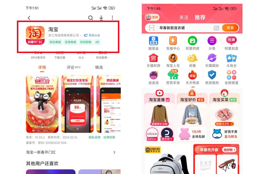
One of the most striking features of Chinese apps is their information density. Unlike Western apps, which often prioritize simplicity and focus on a single task or piece of information at a time, Chinese apps tend to display a lot of information simultaneously. This might seem overwhelming, but it’s actually a reflection of how Chinese users prefer to interact with digital content.
As a tech leader, I’ve come to understand that this preference for information density is rooted in cultural expectations. Chinese users tend to value having all relevant information at their fingertips without needing to navigate through multiple screens. For example, apps like Taobao and WeChat pack their interfaces with deals, news, ads, and more, all on the same screen. This design choice aligns with the Chinese preference for efficiency and the desire to have access to everything they need without extra steps.

2. Bright Colors and Flashy Visuals: Capturing Attention in a Crowded Market
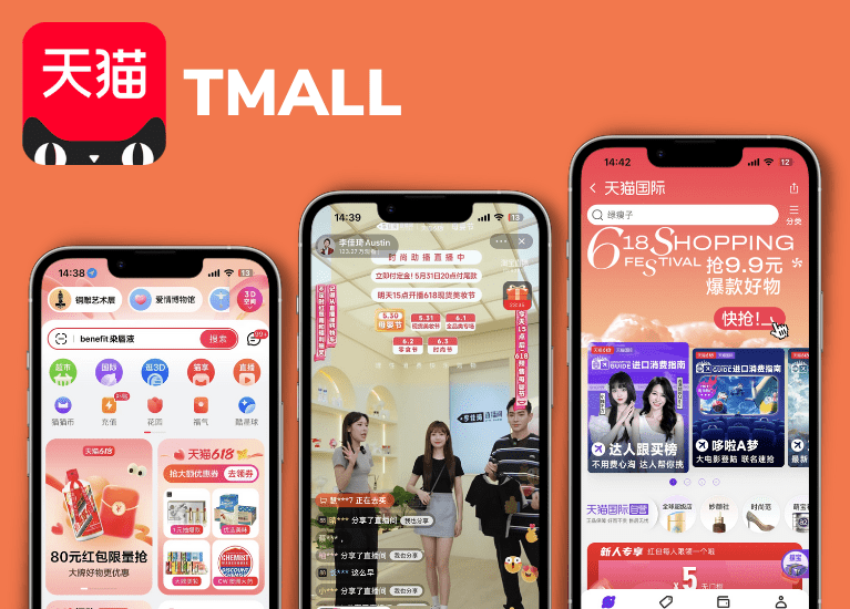
In the West, minimalism and muted color palettes are often associated with sophistication and professionalism. However, in China, bright colors and flashy visuals are not only accepted but expected. These elements are designed to capture attention and keep users engaged in an incredibly competitive market.
From my perspective, the use of vibrant colors and dynamic visuals in Chinese apps is a response to the cultural importance of symbolism and the need to stand out in a market flooded with options. For instance, red, a color frequently used in Chinese apps, is associated with good luck, joy, and prosperity. These cultural symbols are embedded into the app’s design to resonate with the user’s emotions and beliefs.

3. Gamification and Social Features: Engaging Through Play
Chinese apps are masters of gamification and social interaction. Whether it’s daily check-ins, rewards systems, or leaderboards, these elements are pervasive in Chinese app design. As someone who oversees the development of digital products, I recognize that this is more than just a design choice — it’s a strategy to increase user engagement and retention.
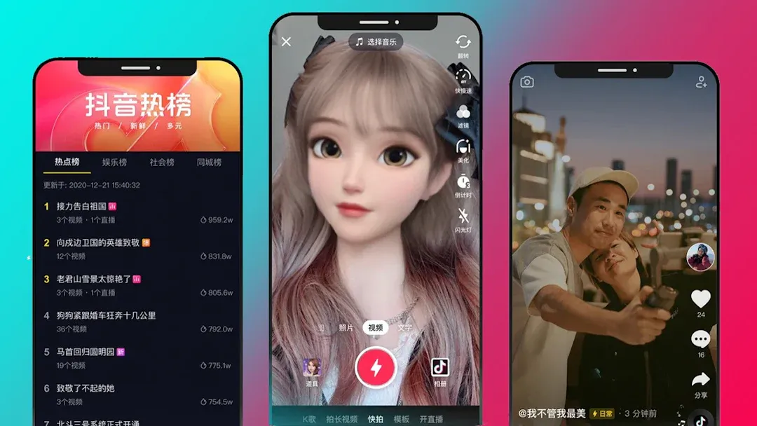
Gamification taps into the competitive spirit and social nature of Chinese users. Apps like Douyin (the Chinese version of TikTok) are designed not just for content consumption but for interaction, competition, and community building. These features encourage users to return to the app frequently, participate in challenges, and share their achievements with friends, creating a more engaging and sticky user experience.

4. Super Apps: One App to Rule Them All
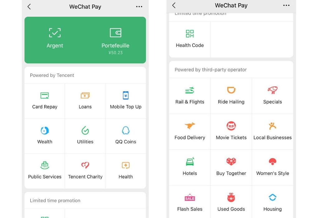
Another fascinating aspect of Chinese app design is the concept of the super app. In contrast to the Western approach, where apps are usually designed to do one thing well, Chinese apps often bundle multiple services into a single platform. This multifunctionality is not just a convenience — it’s a cultural preference.
As a CTO, I see the appeal of super apps in markets like China, where users prefer the convenience of handling various tasks — messaging, payments, shopping, and more — within a single ecosystem. WeChat is the most notable example, functioning as a social media platform, payment gateway, and service hub all in one. The success of super apps in China is a testament to the value of designing products that cater to the local context, rather than adhering strictly to global design trends.

The Cultural Context of Design: A CTO’s Insights
The success of Chinese app design highlights an essential truth: design is not universal. It must be adapted to the cultural and contextual needs of the target audience. As a CTO, understanding this is critical when guiding product development and ensuring that the design choices align with user expectations.
Here are a few insights I’ve gained from observing Chinese app design and how they’ve influenced my approach to product development:
1. Prioritize User Preferences Over Global Trends
While it’s tempting to follow global design trends, it’s more important to prioritize the preferences of your target audience. In China, users expect apps to be information-rich, vibrant, and multifunctional. Ignoring these expectations in favor of minimalist design would likely lead to user dissatisfaction.
When developing products, especially for international markets, it’s crucial to conduct thorough user research and understand the local cultural context. What works in Silicon Valley might not work in Shanghai, and vice versa. As a CTO, ensuring that the design team is aligned with these insights is key to creating products that truly resonate with users.
2. Embrace Bold Design Choices
Chinese app design is bold and unapologetically flashy. This approach might seem counterintuitive to those of us accustomed to the understated elegance of Western design, but it’s a reminder that sometimes, boldness is what’s needed to capture and retain user attention.
As a tech leader, I’ve learned that it’s essential to be open to unconventional design choices, especially when entering new markets. Bright colors, dense information, and dynamic interfaces might not conform to Western standards, but if they align with the cultural preferences of the target audience, they should be embraced.
3. Design for Engagement, Not Just Aesthetics
One of the key takeaways from Chinese app design is the emphasis on user engagement. Through gamification, social features, and multifunctionality, Chinese apps keep users coming back. This is a critical lesson for any tech leader: design should not only be about aesthetics but also about creating a meaningful and engaging user experience.
In my role as CTO, I emphasize the importance of designing for engagement. This means incorporating features that encourage interaction, community building, and frequent use. Whether it’s through rewards systems, social sharing, or interactive elements, the goal is to make the app not just a tool, but a part of the user’s daily life.
4. Consider the Ecosystem, Not Just the App
The concept of the super app is particularly relevant in markets like China, where users prefer integrated services. This approach challenges the Western notion of specialized apps and opens up possibilities for creating ecosystems within a single platform.
As a CTO, I encourage my team to think beyond the app itself and consider how our products can become part of a broader ecosystem. Whether it’s through partnerships, integrations, or building out new features, the goal is to create a comprehensive user experience that meets multiple needs within one platform.
Applying These Lessons in a Global Context
While the specific design choices of Chinese apps might not be directly transferable to other markets, the underlying principles are universally applicable. As a CTO, here’s how I apply these lessons to my work:
Cultural Research: Before entering a new market, we invest in cultural research to understand the local user base. This includes studying user behavior, preferences, and expectations, as well as the competitive landscape.
Flexible Design Systems: We develop flexible design systems that can be adapted to different cultural contexts. This allows us to maintain a consistent brand identity while tailoring the user experience to meet local needs.
Local Collaboration: Whenever possible, we collaborate with local designers, developers, and product managers who have firsthand knowledge of the market. Their insights are invaluable in ensuring that our products resonate with the target audience.
Continuous Feedback Loops: We implement continuous feedback loops to gather user feedback and iterate on our designs. This helps us stay responsive to the needs of our users and make adjustments as necessary.
Conclusion
The success of Chinese app design, despite its "weird" and unconventional appearance to Western eyes, is a powerful reminder that design is not universal. As a CTO, I’ve come to appreciate the importance of cultural context in shaping user experiences. What works in one market may not work in another, and understanding these nuances is crucial to creating products that resonate with users.
In the end, the goal of design is not to conform to a universal standard but to meet the needs and expectations of the people who use the product. By embracing cultural diversity and being open to bold, unconventional design choices, we can create more engaging, effective, and successful digital products.
This perspective has not only informed my approach to product development but has also inspired me to lead my team with a global mindset, ensuring that our designs are not just beautiful but meaningful to the people who use them.